Want to create excellent visual content for LinkedIn?
You’re in the right place.
In this article, you will discover the top LinkedIn image content types and best practices for creating them. We’ll also share our favorite resources for making sure your visuals stand out.
Whether you’re a social media manager or simply aiming to build your personal brand on LinkedIn, following these tips will ensure your content stands out in the feed.
LinkedIn Image Dimensions
Let’s start with the essentials: image sizes.
The last thing you’ll want is to spend time creating a graphic, only to find it looks terrible or gets cropped 😫
Here are the LinkedIn image sizes you’ll need to know when creating content or updating your profile.
LinkedIn Personal Profiles:
- Profile Picture: 400 x 400 pixels
- Cover Image/Background Photo: 1584 x 396 pixels
LinkedIn Company Pages:
- Company Logo Size: 300 x 300 pixels
- Cover Image/Background Photo: 1128 x 191 pixels
LinkedIn Post Image Sizes:
- Image Posts: 1080 x 1080 pixels (square) or 1920 x 1080 pixels (portrait)
- Link Preview Images: 1200 x 627 pixels (these will be turned into small thumbnails when shared organically, and increase in size when sponsored).
- LinkedIn Article Featured Image: 1200 x 644 pixels
- LinkedIn Article Banner Image: 600 x 322 pixels
- Carousels (PDFs): 1080 x 1080 pixels (square) or 1920 x 1080 pixels (portrait)
LinkedIn Video Sizes:
- Video Size: min 256 x 144 pixels to max 4096 x 2304 pixels
- Video File Size: 75KB to 200MB
- Max Video Length: 10 mins
💡 To find out the optimal image dimensions for other social media platforms, check out our social media image sizes guide.
Why LinkedIn Images Matter
Have you noticed that links are now displayed differently on LinkedIn? Replacing the large ‘card’ image preview, you will now see a small thumbnail alongside your link title and meta description.
This change is frustrating to many marketers and content creators who, naturally, want to take up as much real estate in the feed as possible.
We’ve written a guide to adjusting your LinkedIn content strategy in light of this news.
To summarize, focusing on sharing different types of content (especially ‘zero-click’ content) has become more important for standing out. And one of the best ways to do this is by improving the visual elements of your content.
If you’re scrolling through your LinkedIn feed, the content that grabs your attention and takes up the most space on your screen will likely be visual: images, carousels, and videos.
Great visual content has always been fundamental to social media content. Humans are visual creatures!
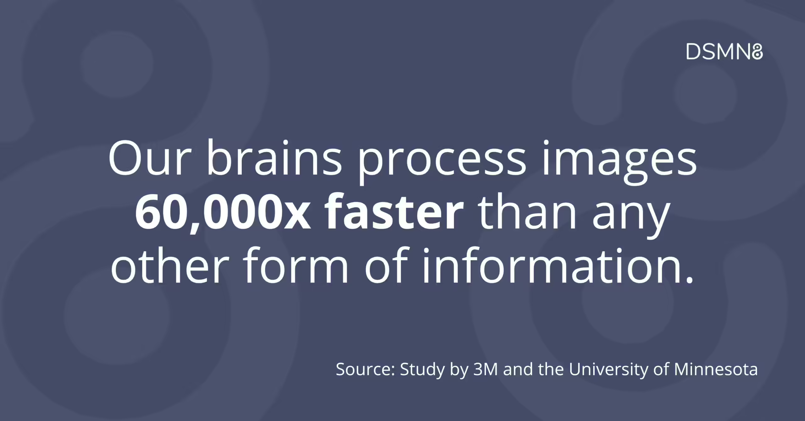
In fact, our brains process images 60,000x faster than any other form of information, according to a study by 3M and the University of Minnesota 🤯
If you’re still not convinced it’s worth creating images or graphics for LinkedIn, here are some more stats to change your mind:
- Visual content is 40 times more likely to get shared than other types of content (Buffer).
- Research by Adobe showed that brand posts with images produced a 650% higher engagement rate than regular text posts.
- People can recall 65% of the visual content they see up to 3 days later (Jeff Bullas).
With this in mind, let’s dive into the different types of images you can create for your LinkedIn content and best practices for each.
Types of Images for LinkedIn Content & Best Practices
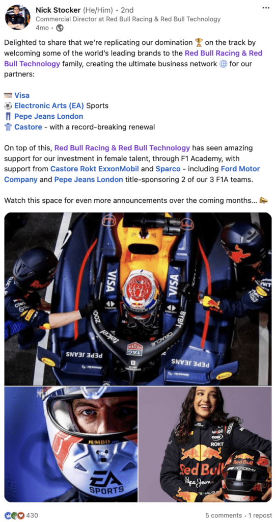
📸 Professional Photos
Repurposing professional photos your company has commissioned (where relevant) is a great way to level up your LinkedIn content.
For example, if you’re sharing a post about a new opening in your company, a photograph of your team will be more authentic than a stock photo.
Job seekers want to see what your company culture is like.
Plus, if these are professional shots, you won’t have to worry about editing the photos!
If you’re an employee advocacy program manager, reach out to your creative or PR/comms teams to assemble a library of photos for employees to use in their LinkedIn posts.
Stock photos are, of course, another option. But exercise caution in this case: some photos are incredibly overused or feel ‘cheesy’ and out-of-date 😬
Consider your company’s brand guidelines and the photo styles they use to make sure you portray the right values and aesthetics.
When looking for stock photos, try platforms like Unsplash and Pexels, where independent photographers upload their images for use. These often feel more authentic than traditional stock photos.
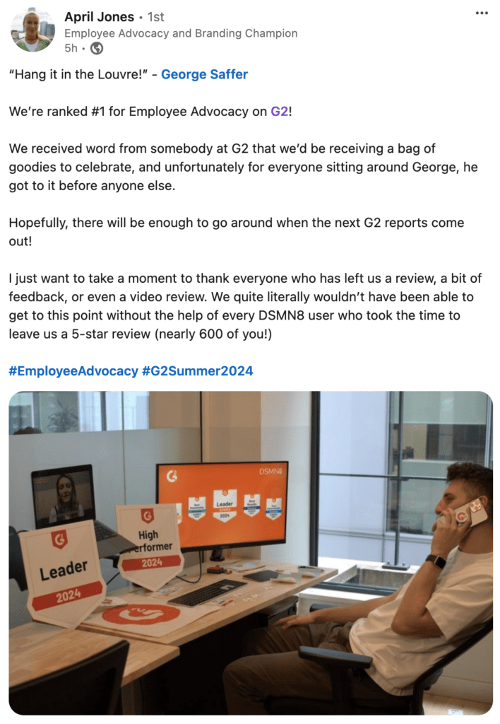
🤳 Candid & Employee-Generated Photos
The ideal scenario here is that your team are keen to take their own photos for their content.
Employee-generated content is not only more authentic and engaging, but it’s more likely to be rewarded by the algorithm for being unique.
If your employees aren’t interested in taking their own photos, get your social media manager involved. Next time there’s a company event, get them to take plenty of pics!
Behind-the-scenes and candid photos showcase your genuine company culture, which is great for talent acquisition.
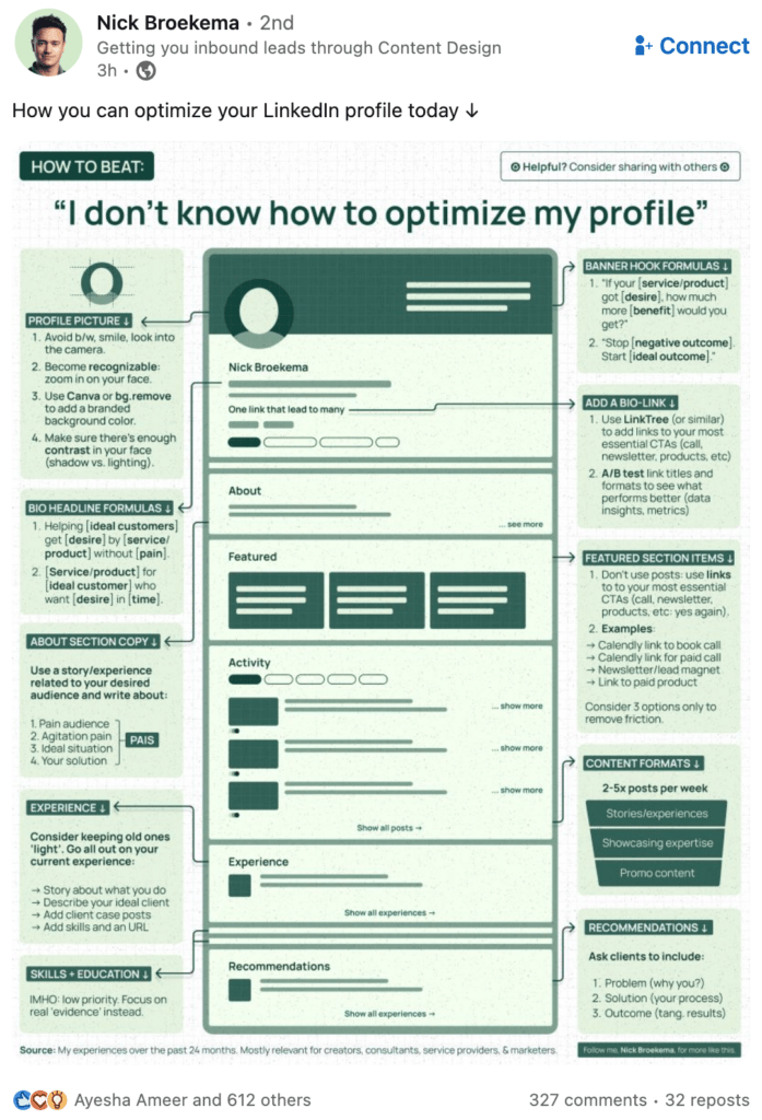
🧠 Infographics
Infographics exploded in popularity a few years ago, but don’t make the mistake of thinking they’re a short-lived trend!
Infographics are an excellent way to present educational content or how-to guides.
To stand out on LinkedIn and build your following, your content should be helpful and valuable. Sharing your knowledge to educate others is the best way to do this.
Well-designed infographics are often reshared on social media, further increasing your reach. To make the most of this visibility, social media reporting helps you measure engagement and optimize future content for even better results.
Best practices for creating infographics:
- Vertical infographics take up the most space in feed, but you can try square or horizontal aspect ratios too.
- Make sure to include your brand name, website, or LinkedIn profile as these images are often saved and reposted on other channels. You deserve credit for your work!
- Make sure your colors go well together. A great resource for this is Coolors, a website that generates cohesive palettes.
- Using Canva’s infographic templates is the easiest way to create your own infographics.
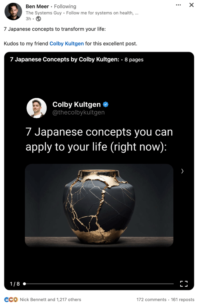
This carousel uses a simple design but it’s highly effective! Notice how it was created by Colby Kultgen, and re-shared by Ben Meer.
🎠 Carousels
Carousel posts serve a very similar purpose to infographics: presenting information in an easy-to-digest way.
To create a carousel for LinkedIn, you’ll need to create a PDF document with each page acting as a ‘slide’.
Best practices for LinkedIn carousels:
- While you can use multiple aspect ratios, square is the most popular. This also means you can repurpose it for Instagram if you wish.
- Add arrows or page numbers to each slide to encourage the reader to swipe through.
- Don’t go too overboard with text: make sure it’s legible on mobile devices.
- Use Canva to easily create a carousel with a professionally-designed template.
- The sweet spot for a carousel is 5-20 slides. Any longer and you risk losing your viewer’s attention.
Make it easy for your team to share content on LinkedIn and track the impact 👇
Hugo Eyre-Varnier cleverly shares a screenshot of Ogilvy’s Financial Times feature, taking up more space in the feed than sharing a link alone.
📱 Screenshots
You don’t always have to create a fancy graphic or get your camera out to share visual content on LinkedIn.
Why not share a screenshot of an article you’re talking about?
Writing a post about the tools you use for work? Share a screenshot.
Seen a great tweet that you want to expand on? Screenshot it. (Tip: use TweetPik for this!)
Aside from giving your readers something to look at, this is a great hack to get around the link preview changes.
As you can see from the example above, the Financial Times article takes up a lot of space in the feed.
If Hugo had simply shared a link, the article would have appeared as a tiny thumbnail. Less impactful for sure!
📊 Charts & Graphs
I don’t know about you, but I love seeing data in a visual way. Charts, graphs, tables… the works.
There’s no better way to back up your points than with data. And the great thing is, you can present it in so many ways!
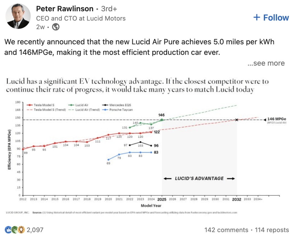
It’s not surprising that sharing original research, studies, and reports is particularly popular on LinkedIn. Especially if you share your own insights alongside the numbers.
Did you know that according to Edelman, 54% of C-level executives spend an hour or more every week reading thought leadership content? 🤯
To reach those decision-makers, use data and your industry expertise to craft compelling thought leadership content.
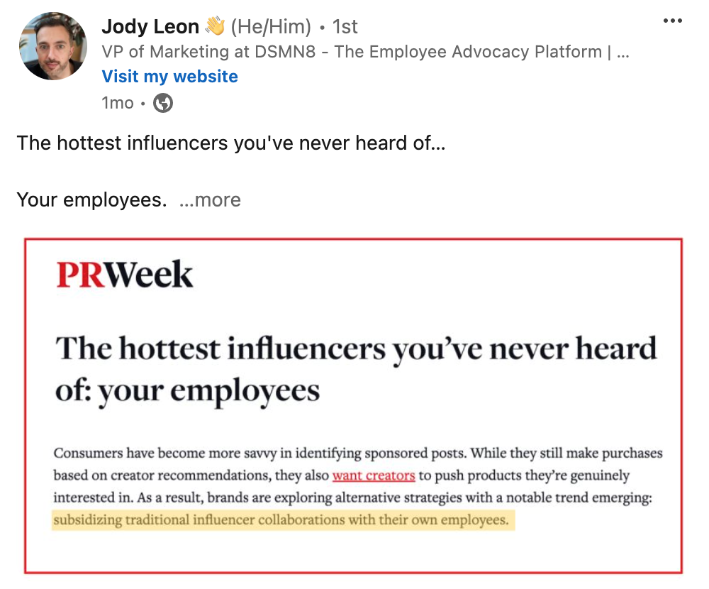
In the example above, Jody quotes PR Week. The image is stands out more than simple text with the outline, brand logo and highlighted section.
💬 Quote Images
Quoting someone?
Creating quote graphics will make your post stand out more than using text alone.
These can be designed in Canva, or you can simply edit a screenshot like Jody did above.
Highlighting the part you want to emphasize or discuss creates visual interest, and using the brand or publication logo adds credibility to the quote.
It’s an easy way to leverage the influence of third-parties while demonstrating that you’re up-to-date on the latest industry news or trends. A win-win! 👏
Plus, if you tag the person or publication you’re quoting, they may engage or reshare your post, enabling you to reach an even wider audience.
Useful Tools for Creating LinkedIn Images
How DSMN8 Helps
One of the most important things to consider when creating LinkedIn content for employees is that you don’t want everyone sharing the same thing.
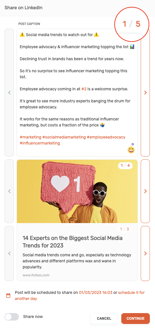
That’s where DSMN8‘s Dynamic Display feature comes in handy.
You can curate multiple captions, link titles/descriptions, and images for every piece of social content.
Let’s say your organization recently won an award, and you want the team to post about it on LinkedIn 🏆
Instead of everyone sharing the same photo of your trophy, you can switch it up with different photos from the awards ceremony.
Combine this with multiple post copy options, and your employees have endless choices, ensuring their LinkedIn networks will see unique content.
Unlike some other employee advocacy platforms, DSMN8 also enables you to upload video content and carousel PDFs for sharing on LinkedIn. Varying your content formats helps boost engagement while providing employees with more choice!
Ready to make it easy for your colleagues to share content on LinkedIn?
More LinkedIn Guides 👇
For more advice on creating great LinkedIn content, understanding the algorithm and optimizing your profile for visibility, check out these guides:
- LinkedIn Link Preview Changes: How To Navigate the Update
- How to Optimize Your LinkedIn Profile for Success
- How to Write the Perfect LinkedIn Post
- The Foolproof Guide to Generating LinkedIn Engagement
- LinkedIn Algorithm Changes (Podcast)
- LinkedIn Discontinues Employee Advocacy Analytics: What To Do Instead
Ready to get started with the #1 employee advocacy platform?
Wondering how active your team already is, and how this compares with your competitors?
Emily Neal
SEO and Content Specialist at DSMN8. Emily has 10 years experience blogging, and is a pro at Pinterest Marketing, reaching 1 million monthly views. She’s all about empowering employees to grow their personal brands and become influencers.

